01 · ChallengeDefining the communication problem.
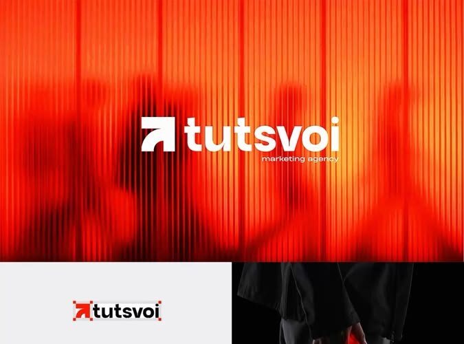
The project needed a visual identity that could feel recognisable across multiple touchpoints without becoming dependent on one layout. The central challenge was to create a system that retained its character when reduced to a small mark, expanded into branded collateral or placed on high-contrast backgrounds.
02 · ResearchReading the context before designing.
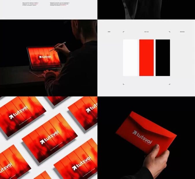
The existing project board suggests a modern, direct and digitally aware brand direction. The design response therefore prioritised a memorable symbol, a controlled red–black–white palette and high contrast. Because no formal audience research or performance data was included in the supplied portfolio files, this case study focuses on observable design decisions rather than claiming measured market results.
03 · StrategyTurning observations into a focused direction.
The identity was organised around three principles: instant recognition, controlled contrast and repeatable application. The mark was treated as the anchor, while the colour and composition rules created consistency across cards, mockups and digital surfaces.
04 · Design processBuilding the system step by step.
- Refine the primary mark so it remains clear at small scale.
- Establish a compact colour system with strong contrast.
- Test the identity on different materials and display contexts.
- Use consistent spacing and framing to make every application feel related.
05 · DeliverablesWhat the project produced.
- Primary logo and symbol presentation
- Colour and contrast direction
- Business-card and collateral applications
- Digital mockups and brand presentation board
06 · OutcomeA stronger, more coherent visual result.
The completed presentation demonstrates a cohesive identity language rather than a single isolated logo. It gives the brand a clear visual centre and a practical basis for future applications. No numerical campaign or commercial results were supplied, so the outcome is stated in terms of consistency, scalability and production readiness.