01 · ChallengeDefining the communication problem.
A real-estate brand needs more than occasional sales flyers. The communication challenge was to maintain visual consistency across different weekly messages—family, progress, motivation and weekend lifestyle—while keeping the brand identifiable and the content easy to understand at social-media size.
02 · ResearchReading the context before designing.
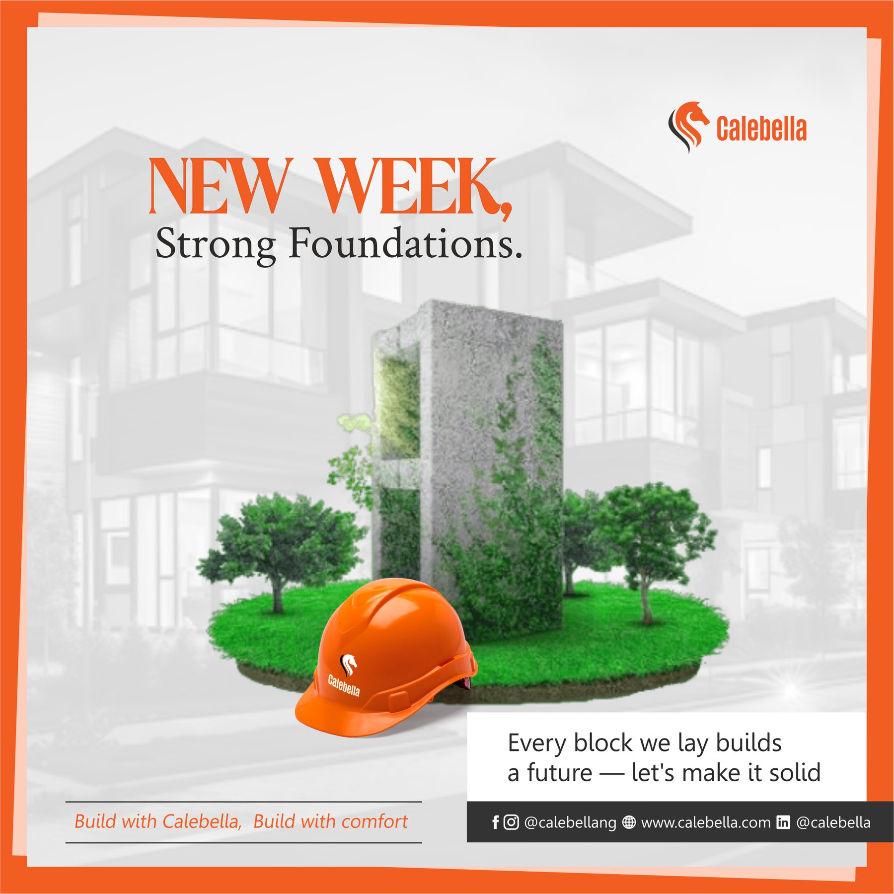
The supplied series shows a recurring orange accent, white space, architectural imagery and a stable logo position. These elements support brand recognition while allowing the message and photography to change. No engagement analytics or audience interviews were included, so the review is based on the visual system visible in the provided files.
03 · StrategyTurning observations into a focused direction.
The campaign used a modular approach: consistent framing and brand placement, a flexible headline area, a dominant lifestyle or property image and a concise footer for supporting information. This created variety without losing continuity.
04 · Design processBuilding the system step by step.
- Define reusable margins, logo placement and orange accent rules.
- Select one primary message for each post to protect readability.
- Balance lifestyle photography with real construction and property imagery.
- Maintain the same visual rhythm across weekly posts.
05 · DeliverablesWhat the project produced.
- Recurring social-media campaign templates
- Lifestyle and family-oriented posts
- Construction-progress communication
- Weekly Monday and TGIF engagement assets
06 · OutcomeA stronger, more coherent visual result.
The final set functions as a recognisable campaign family. Each post communicates a different idea, yet the repeated framing, accent colour and brand position make the series feel coordinated. Performance figures were not supplied, so no reach or conversion claims are made.