01 · ChallengeDefining the communication problem.
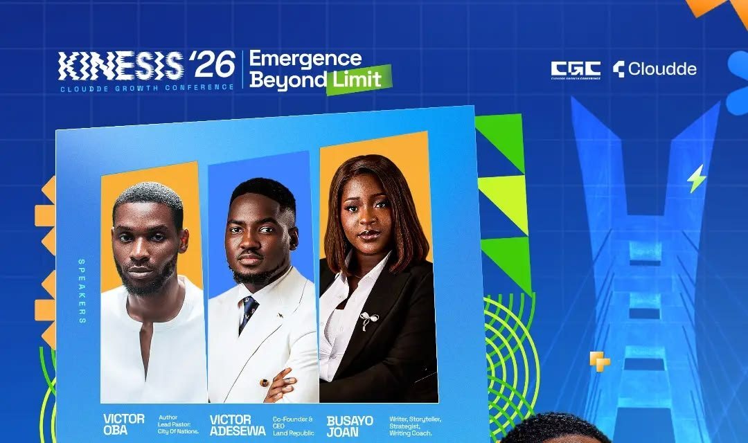
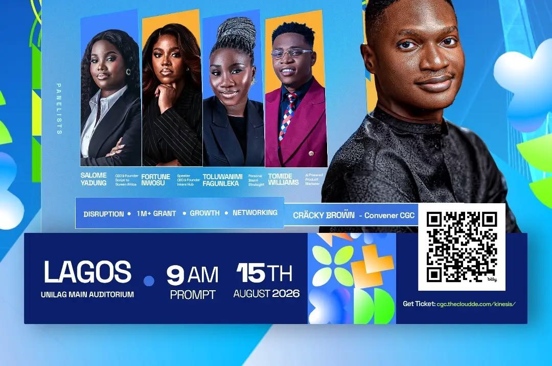
Conference flyers frequently contain many competing details. The challenge was to create a dynamic event identity while ensuring that the theme, speaker lineup, date, location and registration route could still be understood quickly on a mobile screen.
02 · ResearchReading the context before designing.
The supplied artwork indicates a technology- and business-oriented event with several speakers and a strong digital theme. A blue foundation supports trust and professionalism, while neon green geometry provides movement and a contemporary event character. No attendee or campaign data was included in the supplied project.
03 · StrategyTurning observations into a focused direction.
Information was grouped by priority. The conference title and primary speaker receive the strongest scale, supporting speakers sit within a clear panel, and logistical details are consolidated at the base. Colour and angled geometry create energy without replacing the information structure.
04 · Design processBuilding the system step by step.
- List every required item and rank it by viewing priority.
- Build a clear grid for title, speakers and event logistics.
- Use contrast and scale to separate primary and secondary information.
- Check readability at reduced social-media size before final export.
05 · DeliverablesWhat the project produced.
- Primary conference campaign flyer
- Speaker hierarchy and portrait composition
- Registration QR-code placement
- Digital and social-media-ready output
06 · OutcomeA stronger, more coherent visual result.
The final design presents a large amount of event information in a controlled visual hierarchy. It remains energetic while giving each essential detail a defined place. Attendance and conversion data were not supplied, so the case study does not claim numerical event results.