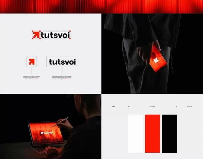
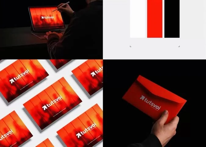
What needed to work
The identity needed to feel modern and distinctive while remaining simple enough to work across small digital placements, print applications and branded presentation materials.
Case study · Brand identity · Visual system
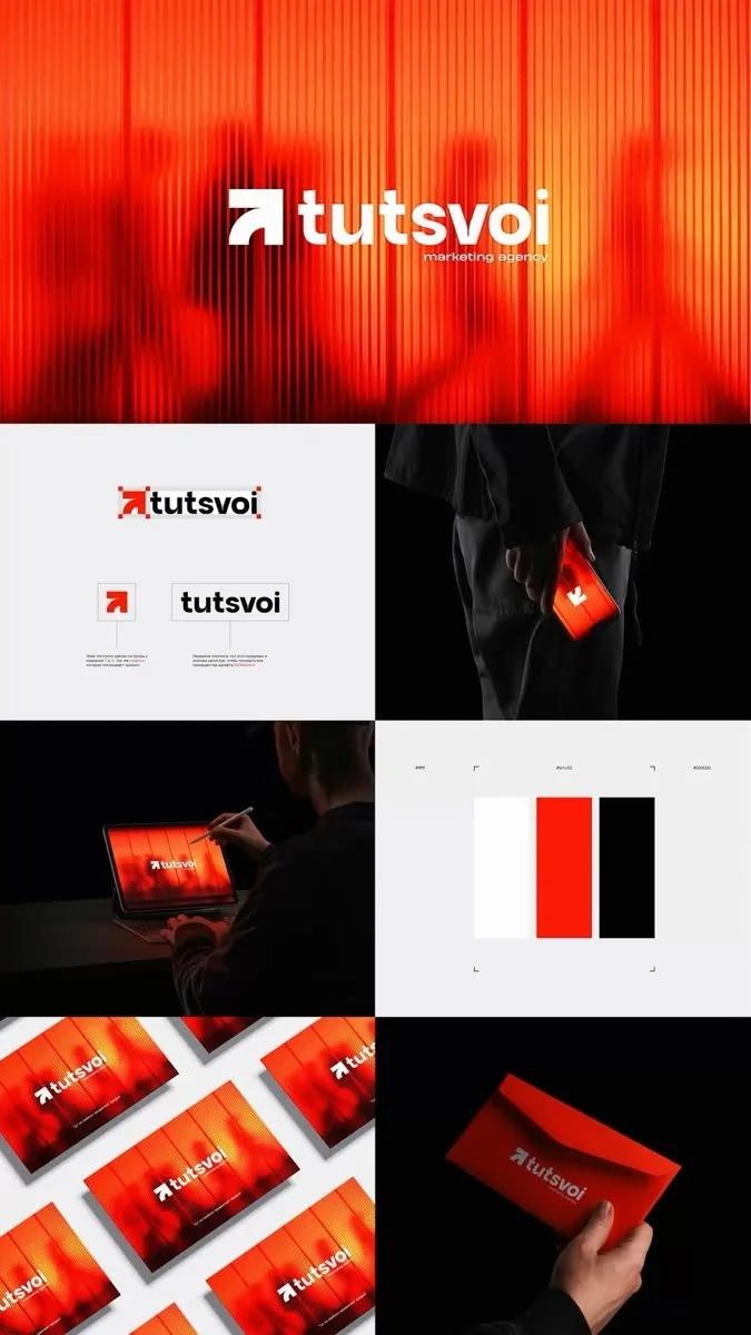
A concise identity presentation built around a bold mark, controlled colour palette and adaptable applications.
Overview
A concise identity presentation built around a bold mark, controlled colour palette and adaptable applications.
The identity needed to feel modern and distinctive while remaining simple enough to work across small digital placements, print applications and branded presentation materials.
A compact geometric mark became the anchor. Red, black and white created a direct visual voice, while the presentation system demonstrated spacing, contrast and application logic.
Rather than treating the logo as a single isolated asset, the work presents a small visual system that can guide future touchpoints and keep brand use consistent.
Selected outputs
The work is presented using the available final assets. No unverified performance metrics or client quotations have been added.